Orignal article posted by Dwell
We’re all ready for a change of scenery! Having spent the bulk of the last year indoors, most people are on the edge of their seats. Though shelter-in-place mandates may not end anytime soon, transforming your rooms and walls with new color ideas can have a huge effect on your mood.
Industry experts predict that certain paint shades can invigorate or soothe us after a volatile year.
Think about your home. Is it outdated or does it need a splash of… something! The colors that you choose should be rejuvenating and inspiring. Dank, dark, and dull colors can really drag down your mood and your emotional state and it’s possible the 2021 Pantone colors of The Year aren’t your jam. So it might be time to switch it up.
Warm Nuetrals
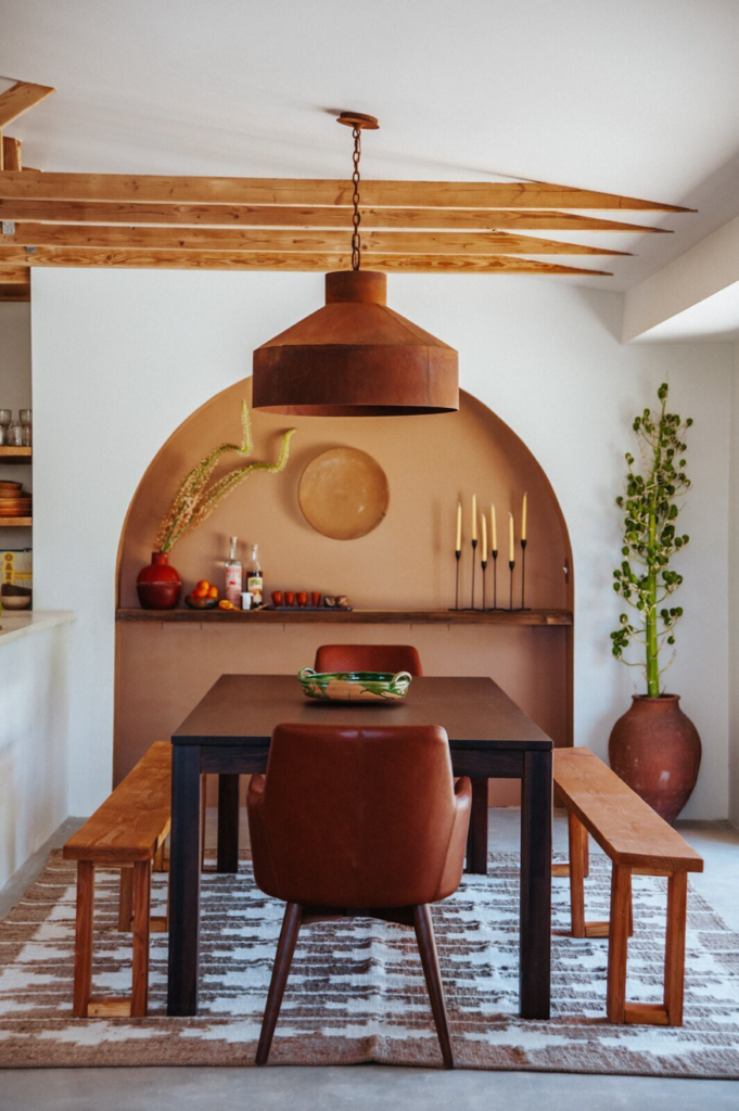
Warm Neutrals can be used throughout the house to add warmth but still maintain flexibility. Taupe may be making a comeback in 2021, which remains neutral while adding depth to your space.
Taupe’s pink undertones flatter all skin tones, making it a natural choice for a bathroom refresh, too. You can certainly use it throughout your home though – perhaps paired up with black,, green, gray or blue. These paint colors are all the rage!
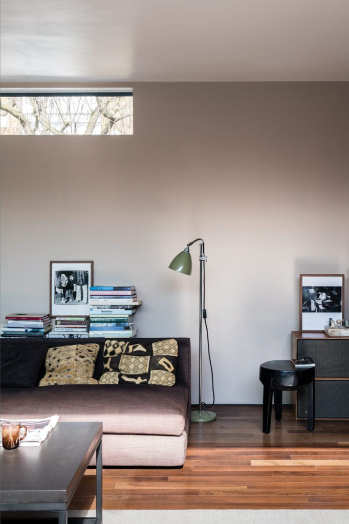
Use the above brown-based neutral by Farrow & Ball for your bedroom. A light “Stony Ground” sandy color can be used for the trim to offset a bold, red hue in say, the dining room. Keep your dining rom rich by using bold colors for dramatic impact in low light. Keep the trim in a good neutral and repeat these paint colors on the ceiling.
Warm neutrals can energize a space without being too overwhelming.
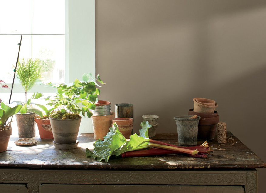
Warm neutrals can be used as transition colors between rooms to connect a palette, especially in gathering spaces where friends and family come together. Try pairing [Benjamin Moore’s] Kingsport Gray in an eggshell or flat finish with a deeper hue like Silhouette,”. “Or play to its cooler side by pairing it with a Gray Cashmere trim & Foggy Morning.
Black
Dramatic Black is back. The desire to declutter and simplify your mind is bringing back paint colors like [Krylon’s] Matte Black. Try the shade alongside whites and wood tones for a rustic feel that has depth.
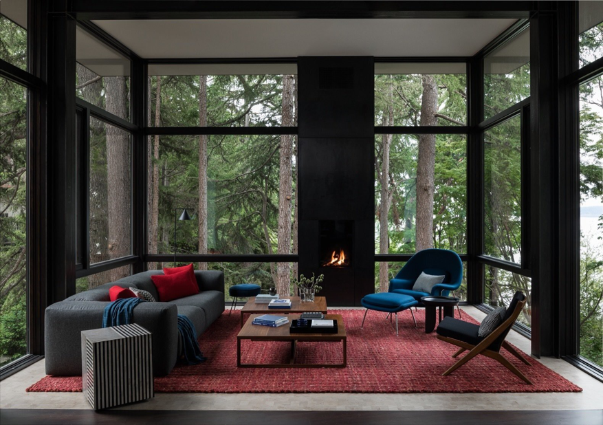
Blacks are taking a more prominent position in focal rooms in the house this year, such as bathrooms and kitchens. Much like whites, blacks work with just about any other color on the spectrum.
You can also use black as an undertone if it’s just too much of a statement for you. You can mix black with paint colors mauve, maize, and off-white for a muted, contemporary classic setting.
Natural Greens
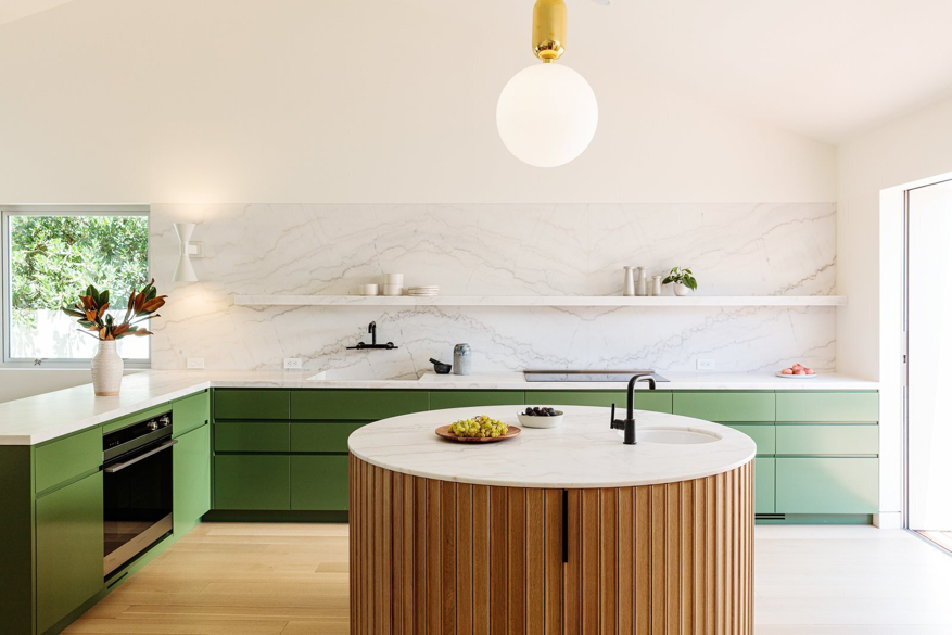
Industry experts predict that green will look wonderfully inviting in common areas like kitchens and living rooms. Green typically promotes comfiness and relaxation – a sense of calm. Consider Sap Green [by Farrow & Ball], which is strong but has an underlying brightness running through it.
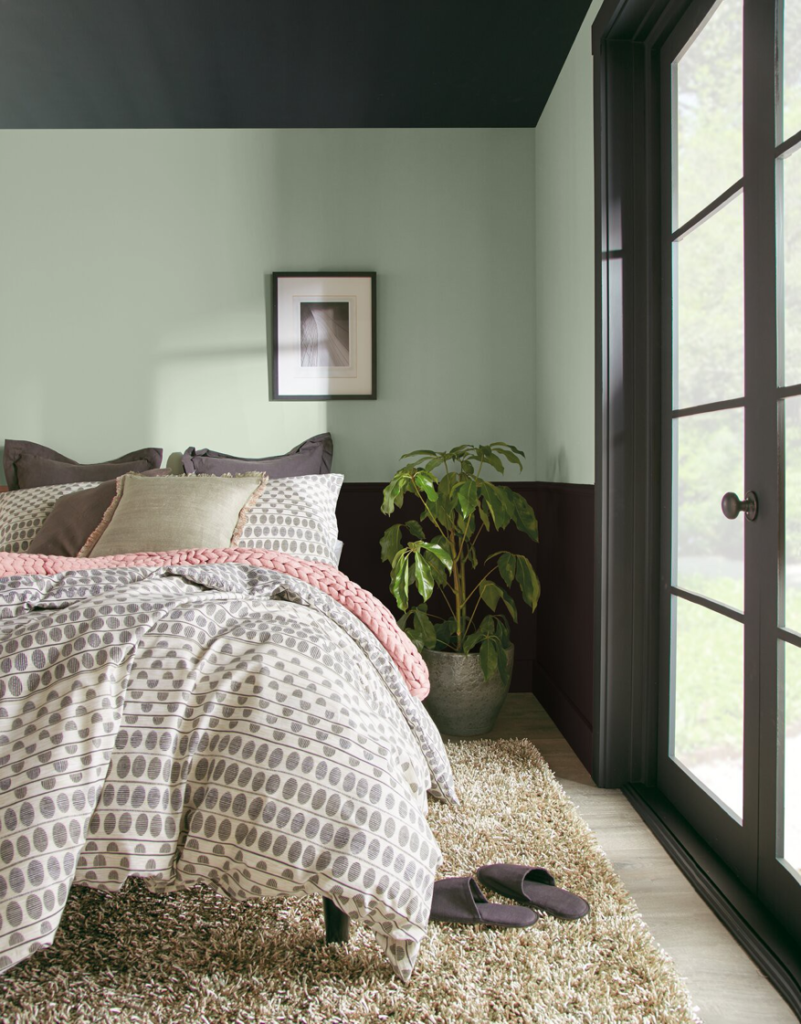
In the past, we’ve written about the power of serene colors and peaceful spaces. this is most important in the place where you retreat to let the day’s burden slip away. Your bedroom should be a sanctuary and using beautiful jades or pistachio greens can bring a renewing power of nature into your home.
Serene Blues
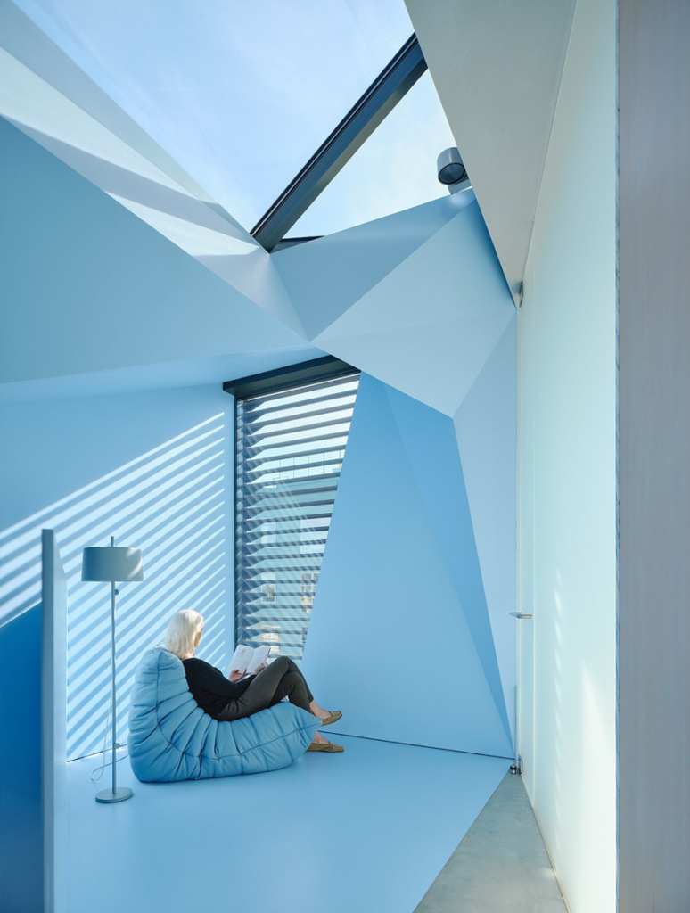
Calming blue… It is not surprise that blue makes the list of paint colors for your home in 2021. It can be so soulful and relaxing. There are many rooms that look great in blue, one in-particular the bathroom. Blue contrasts so perfectly with classic white details that we often see in this room – like trim, tubs and toilets and linens.
For this year’s shades, think [Farrow & Ball’s] Ultra Marine Blue in Modern Emulsion for walls, paired with All White in Estate Eggshell on woodwork. You could even carry the Ultra Marine Blue over the ceiling for a beautiful design statement.
Contact Tiffany Hanken Interior Design
Is 2021 your year for home renewal? Whether you’re seeking advice on single rooms or an entire home design redo, the team at Tiffany Hanken Design is ready for your project.
