
An incredibly impossible year has passed us by with the New Year handoff from 2020 to 2021. That’s not to say that more challenges and unprecedented times are not ahead of us. They are… But interesting things still happened in the world of design in general. The MOST “illuminating” one being the Pantone Color(s) of the Year.
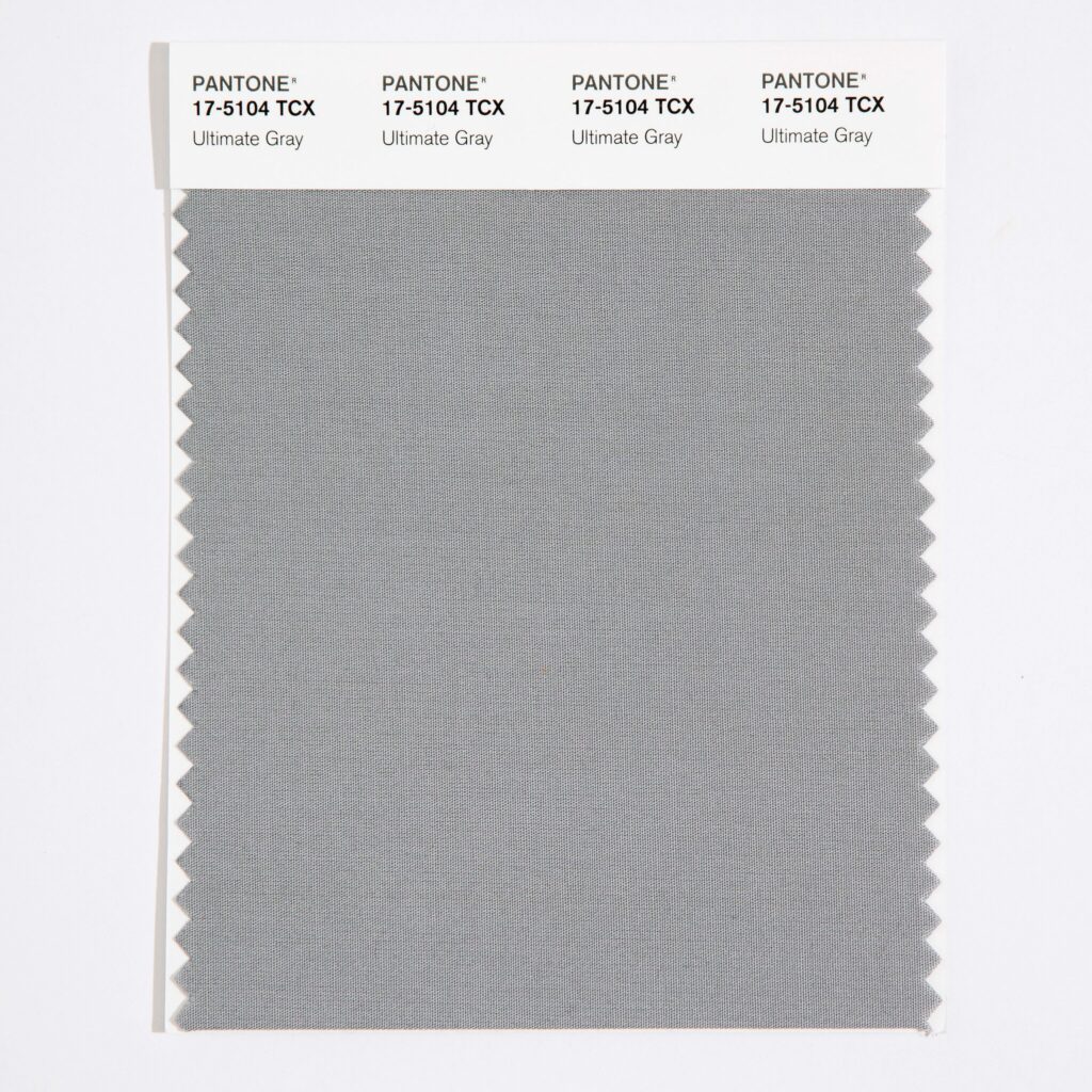
Ultimate Gray 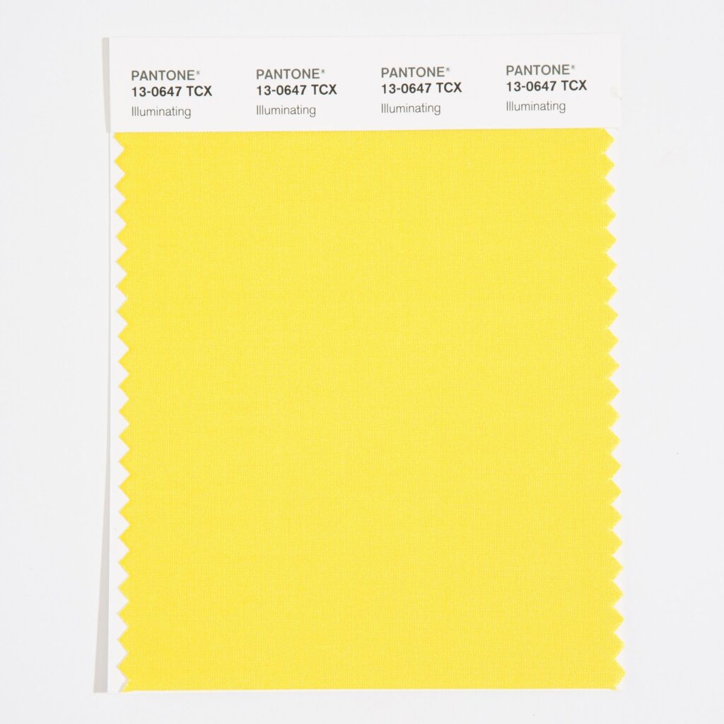
Illuminating
Two Pantone Colors
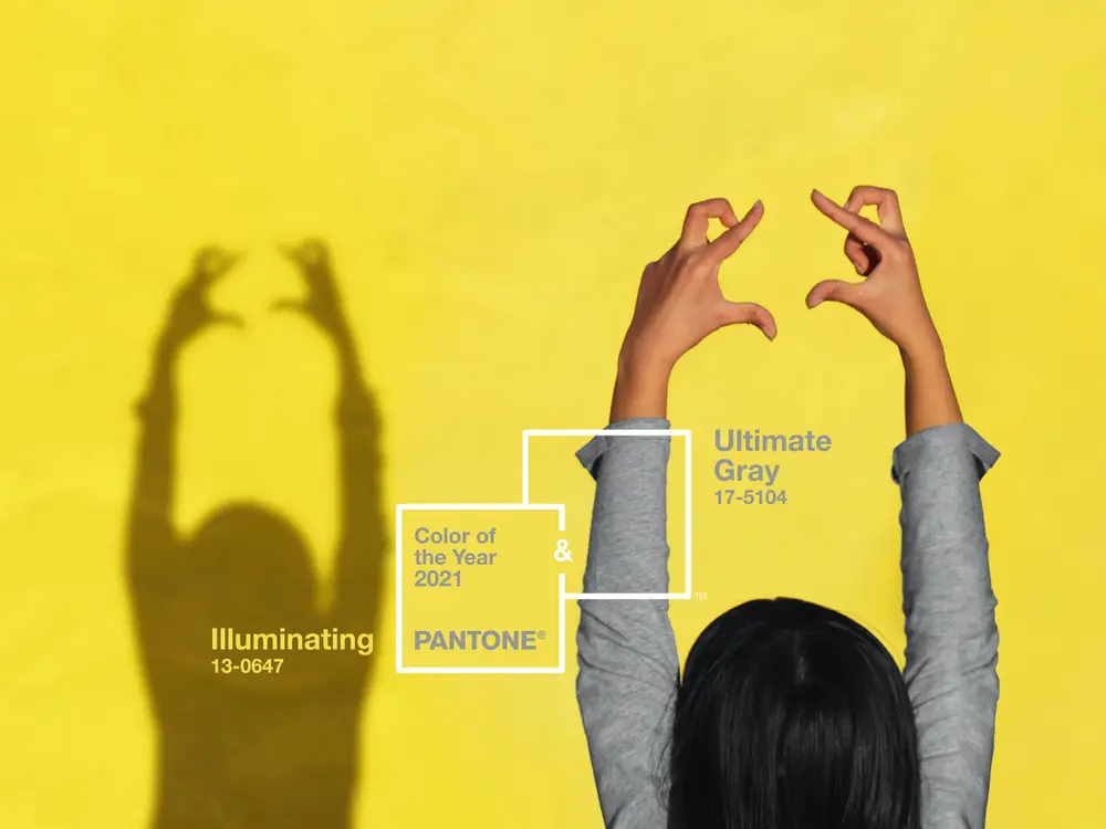
This year, just like in 2016 with the blending of Rose Quartz and Serenity, Pantone unveiled not one but two colors. They are a bright, sunny yellow named Illuminating and ultimate gray, which (as its name suggests) is a rather dank and flat gray. The reasoning behind the two shades, Pantone says, is to reflect both the solemnity of 2020 and the hope for a more promising future. An interesting color combo that seems to make sense.
The selection of two independent colors highlights how different elements come together to express a message of strength and hopefulness that is both enduring and uplifting, conveying the idea that it’s not about one color or one person, it’s about more than one.
Leatrice Eiseman, executive director of the Pantone Color Institute
A symbol of healing
Pantone has been choosing a color of the year for 22 years and this is only the second time that two colors have been selected. That previous year mentioned (in 2016), the two shades were meant to blend into each other, reflecting the recognition of gender fluidity and social progress. But this year, the two shades are meant to stand on their own, as complementary tones, supporting each other.
A subtle reminder perhaps of what all need.
It is also the first time that a gray has earned the honor of being chosen and only the second time for a yellow. As it happens, both shades were added to the Pantone color wheel earlier this year.
Dependable gray. Illuminating yellow.
One person’s dependability is another person’s depressing, and many people are over with the gray. However, this is where Illuminating comes in. It’s not the egg yolk-like yellow of Mimosa, the color of the year 2009, nor a citrus or highlighter yellow, but more of sunshine, or happy emoticon yellow. Admittedly, it brings an interesting twist to the Pantone color combo.
We’ve all been immersed in gray for so long now – all the grays. And indeed, of all the grays in the palette, Ultimate Gray is a determinedly neutral kind of gray. It is not dark, dull gray or soft and luxurious gray color but a more solid, granite-like gray. The kind of gray you might associate with wisdom on morgan freeman’s head.
The power of color
Apart from serving as both a symbol of what we’ve endured in the preceding 12 months as well as a prediction for the future, Pantone’s Color — or Colors — of the Year serves an entirely separate purpose: they set the tone for the consumer retail industry.
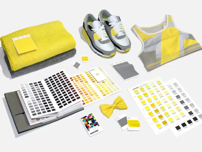
Mainstream Relevance
“There’s an iconic scene in the 2006 film “The Devil Wears Prada” that helps explain the color phenomenon. In the film, Anne Hathaway’s character, Andy, quietly scoffs at two similar-looking turquoise belts someone had just described as being “so different.”
Andy’s reaction leads Meryl Streep’s character, Miranda Priestly, to turn on her and unleash a seemingly calm yet undeniably eviscerating explanation of the power of the fashion industry and its trickle-down effect on consumer products.
To drive home her point, Priestly uses Andy’s blue sweater as an example: it’s not just blue, it’s cerulean, and four years prior, designers Oscar de la Renta and Yves Saint Laurent had both used cerulean in their runway collections. The color then made its way through other designers’ collections, into department stores, and finally into the average person’s closet.” ~ Business Insider
This trend and these ideas have played out time and time again over the years, like in 2016 when Pantone picked rose quartz as one to two Colors of the Year, just as a pale, salmon pink was seemingly the emerging color choice for every millennial-helmed brand hitting the market.
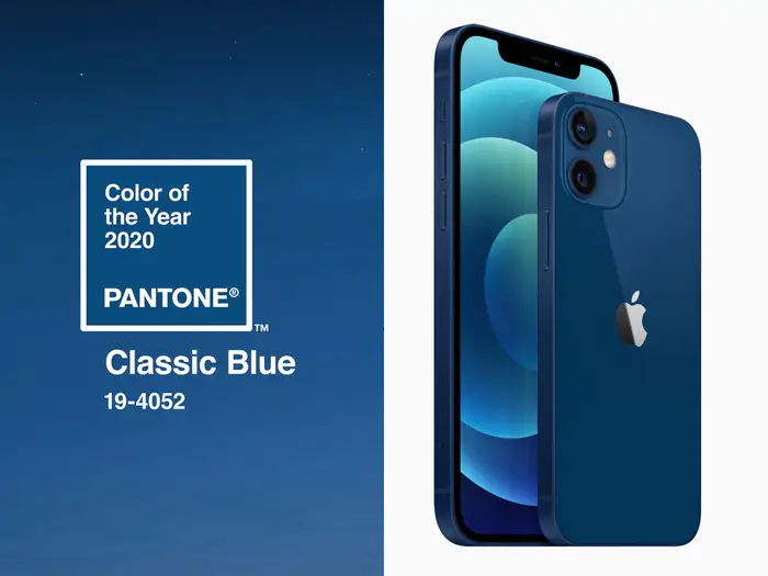
You’ll also see major trend-setters like tech giant Apple bringing relevance to Pantone’s choices. Behold one of the newest iPhone color options with the launch of the iPhone 12 as a match to Pantone Color of the Year 2020.
So while these may not be your favorite colors they have a greater purpose. Their intention of being practical and grounded while at the same time warming and optimistic gives this color combination the attributes of resilience and hope. Uplifting encouragement for the human spirit.
And the news of the coronavirus vaccine this past month has reinforced Pantone’s selection. “Even in the gray sameness of our current days, the future does look a whole lot brighter. Illuminated, even.” ~ New York Times
Help with Interior Design
You may find that Ultimate Gray and Illuminating are just perfect for your life; they suit your style… Then again, you may be looking for anything but Pantone’s suggestions. I’ll definitely have opinions and advice for you either way.
Contact our team of interior design professionals today to help select the correct color palette for your family and your home.