A true story about neutral paint colors
So you’re at your local hardware store, Home Depot or Interior Design shop and you’re faced with staring at a wall of color selections that make your head spin. What seemed like a great idea in the weeks of planning leading up to this journey, now seems daunting and like too much work. How many options for white can there be? To your naked eye, “50 shades of grey” or beige can all look pretty much the same. But to discerning interior designers who spend their days looking at paint swatches, fabric samples and accoutrement placement – each color, even in its most subtle discrepancy has purpose and vision. One small change in neutral paint colors can make all the difference in your quest to design the life you love.
You can ask any interior designer which color you should use on a bedroom wall, a ceiling, kitchen cabinets or bathroom accent wall and they will have very precise answers for you. When moving from one space to the next, the color attributes that they look for may be completely different. But in the eye of the designer, they may all play together to bring one feeling and emotion to the entire home. Interior designers are often looking at the small details when they enter a room – architectural highlights, transitions from day to night, rooms that need help retaining natural light, etc. In order to achieve some of these things, you can play within the vast realms of white’s, grays, and beiges. Here are a few timeless color ideas.
The Best Whites
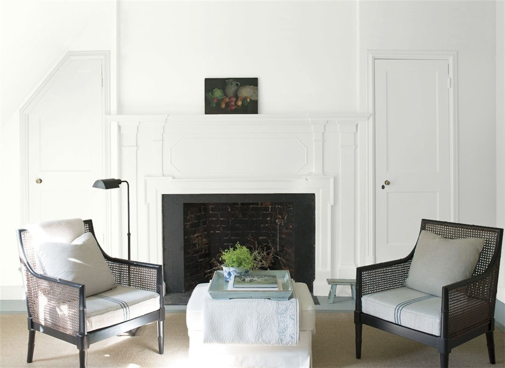
Benjamin Moore Simply White ($38)
Benjamin Moore Swiss Coffee ($38)
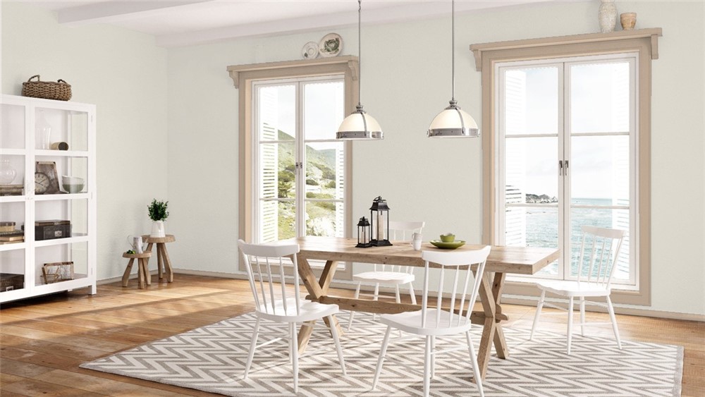
“This color is part of the Off-White Color collection. Inherently sophisticated and endlessly versatile, the Off-White collection offers subtle nuances of whites that suit tranquil, serene environments as well as creates color-enhancing accents for dynamic spaces. A compilation of 152 white and off-white colors.” This is a great selection for trim and paneling when or if you’re trying to achieve a cooler tone. It’s white… but never seems to look unfinished. It pairs with black and deep browns really well.
Benjamin Moore Chantilly Lace ($38)
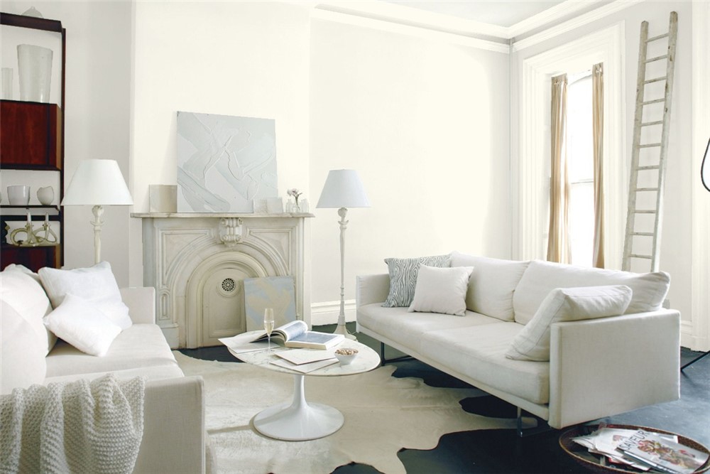
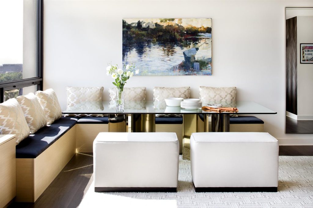
“As delicate and refined as the lace it was named after, this crisp, clean white evokes images of pure silk, soft linen and simpler times.” This is a pure, crisp white that can be used for the backdrop for layering textures and styles. If you like bright rooms, then learn how to use this paint color in key areas.
Benjamin Moore Acadia White ($38)
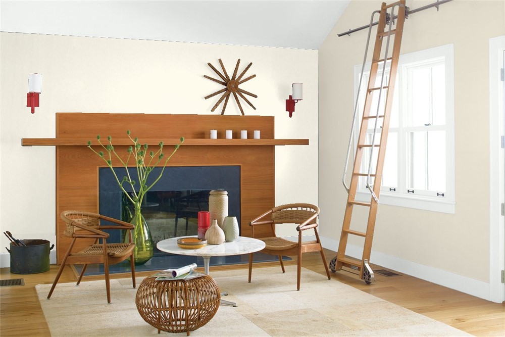
“This color is part of the Off-White Color collection. Inherently sophisticated and endlessly versatile, the Off-White collection offers subtle nuances of whites that suit tranquil, serene environments as well as creates color-enhancing accents for dynamic spaces. A compilation of 152 white and off-white colors.” This paint color is a good choice for ceilings and trim. It helps to highlight architectural details while still bringing some warmth to your room.
The Best Beiges
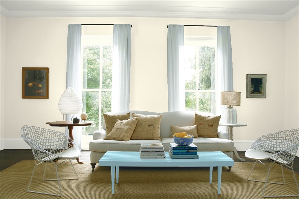
Benjamin Moore Ballet White ($38)
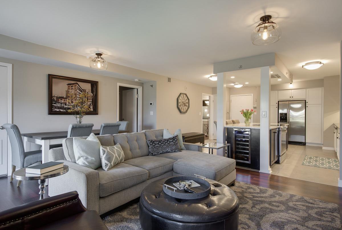
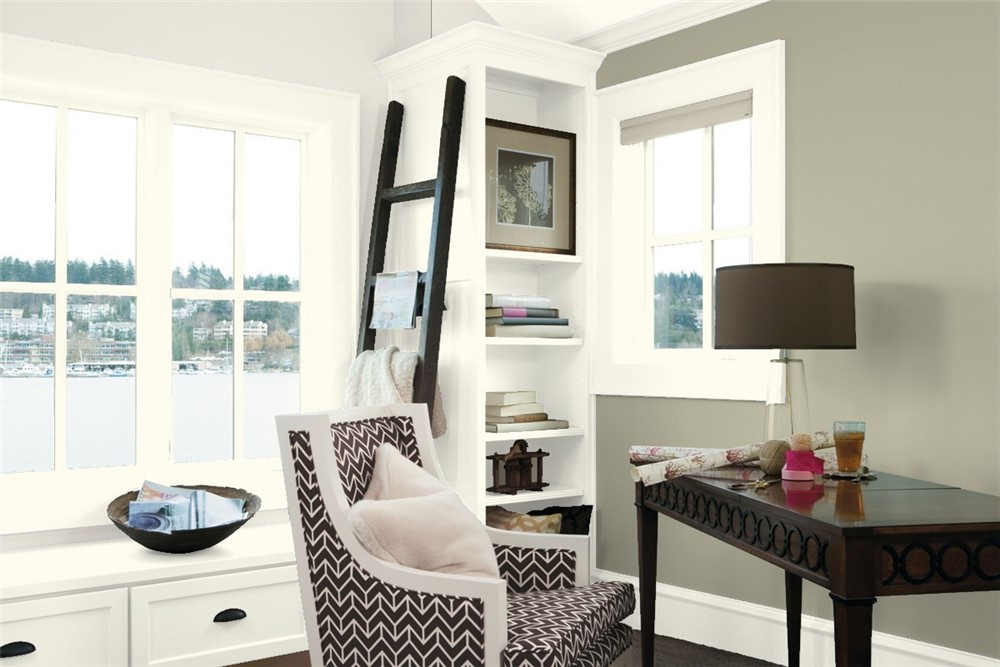
“This color is part of the Off-White Color collection. Inherently sophisticated and endlessly versatile, the Off-White collection offers subtle nuances of whites that suit tranquil, serene environments as well as creates color-enhancing accents for dynamic spaces. A compilation of 152 white and off-white colors.” This color is extremely versatile and changes it’s complexion throughout the day as light passes through the house. Sometimes it’s beige and sometimes it’s gray. It offers just enough warmth to not feel sterile like many whites can do. You can see it here on the ceiling.
Farrow & Ball Skimming Stone ($99)
“This stony off white takes its name from a 19th century skim, or plaster color, but often reminds us of childhood afternoons skimming stones. With its warm light grey undertones, Skimming Stone is extremely versatile and particularly suited to soothing bedroom schemes. A Contemporary Neutral, it sits with the lighter Strong White and darker Elephant’s Breath for a clean and contemporary look, but can also be used in a darker statement scheme alongside Pelt or London Clay.
Benjamin Moore Balboa Mist ($38)
“This color is part of the Classic Color Collection. Surround yourself with your color favorites. These timeless, elegant, Classic Colors guarantee beautiful, usable color all the time, every time. A collection of 1,680 inspired hues that consumers and professionals have enjoyed for years, the colors in this palette are as timeless as they are forward.”
Farrow & Ball Dimity ($99)
“Dimity is named after the lightweight cotton fabric originally used to make ladies’ bustles, but which is now more commonly used for bedding. One of our Red Based Neutrals, this pale and subdued taupe is brimming with warmth and an unmatchable depth, making it perfect for elegant and understated hallways. It can be combined with All White and Pointing to read pinker, or with the darker Oxford Stone on woodwork for a slightly aged look and relaxed feel.”
The Best Grays
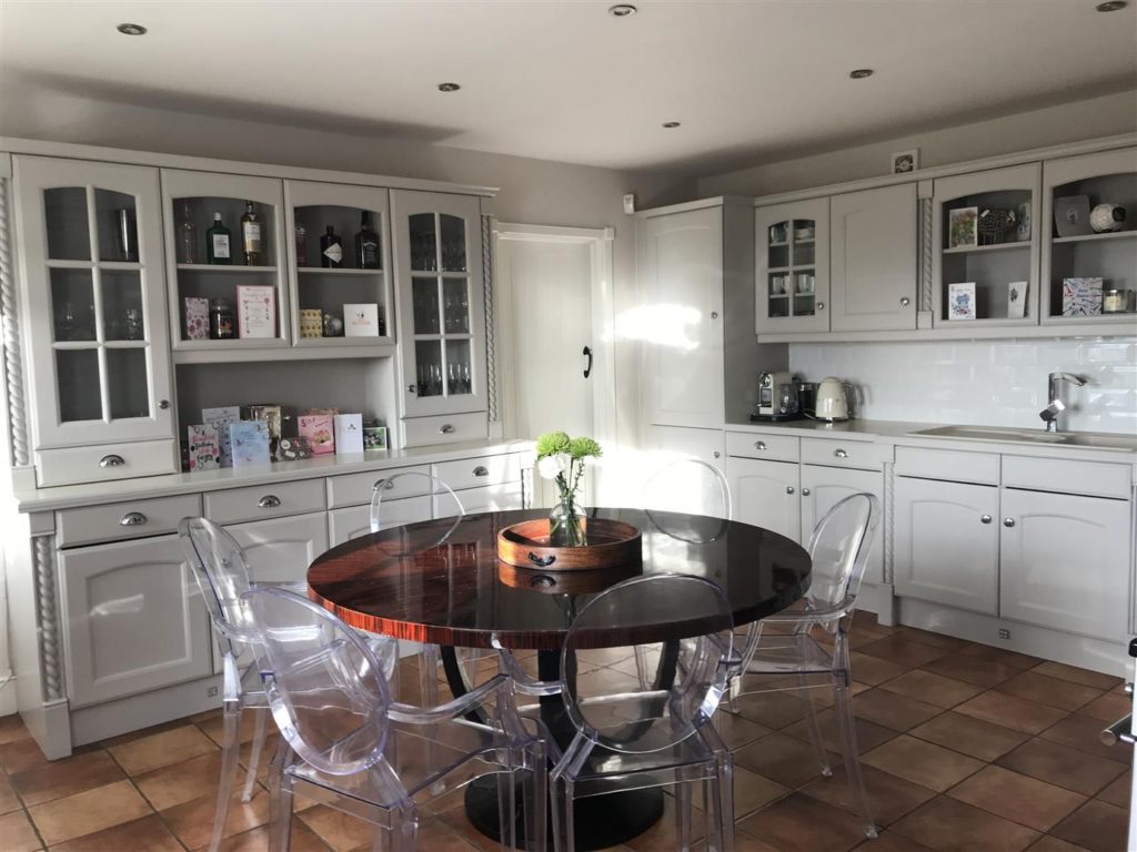
Benjamin Moore Shoreline ($38)
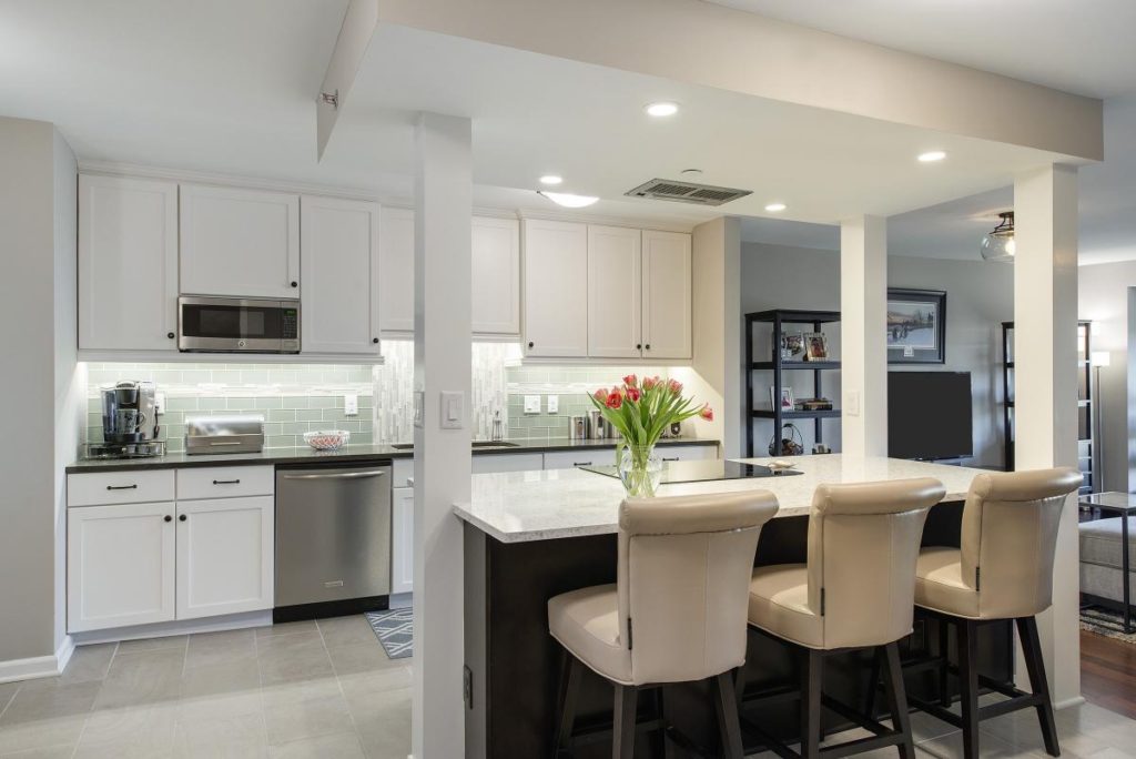
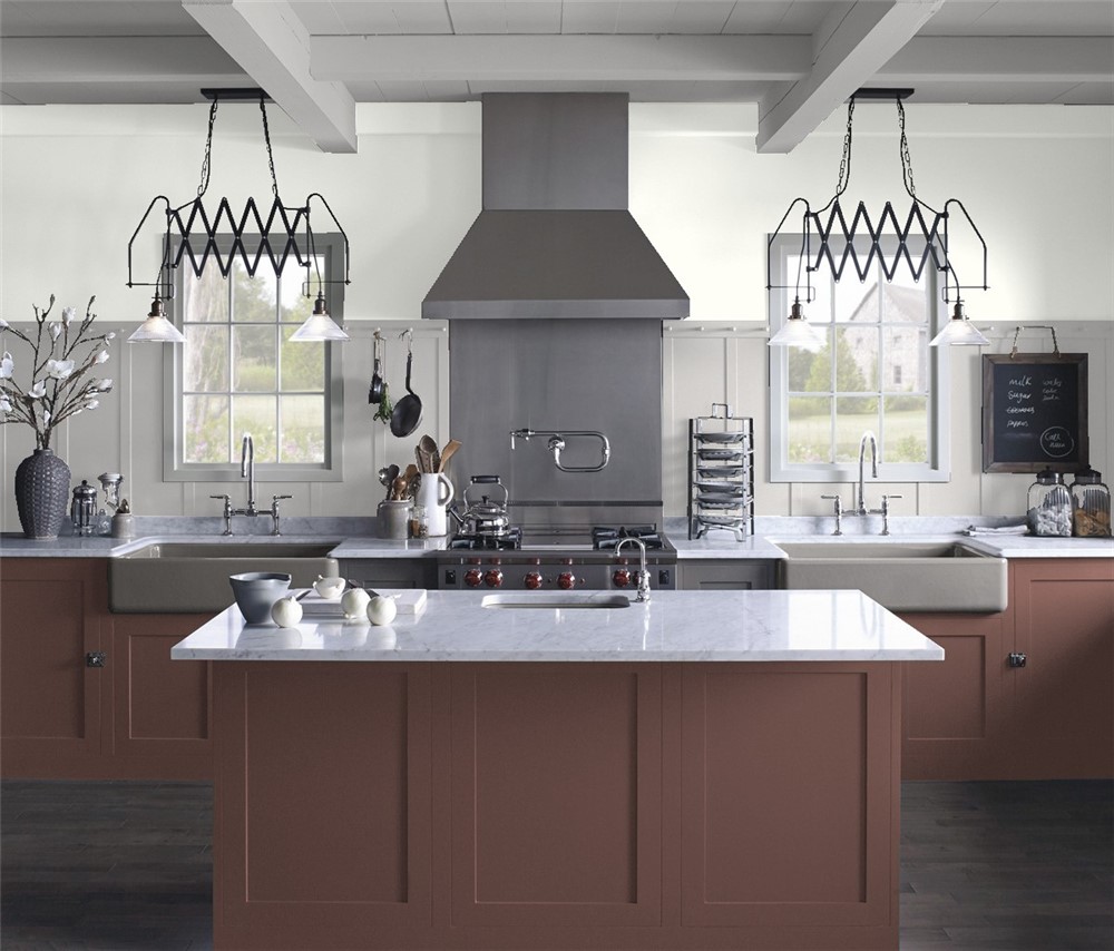
“This color is part of the Classic Color Collection. Surround yourself with your color favorites. These timeless, elegant, Classic Colors guarantee beautiful, usable color all the time, every time. A collection of 1,680 inspired hues that consumers and professionals have enjoyed for years, the colors in this palette are as timeless as they are forward.” See it here in the upper portion of this kitchen’s walls.
Farrow & Ball Calluna ($99)
“Calluna takes its name from the beautiful heather so prolific across the moors of Scotland. A touch of black ensures that it appears more lilac than pink, making this color feel both soft and tranquil yet strangely sophisticated. It can be contrasted with sympathetic Great White or used with darker Brassica and Pelt to great effect.” This gray is infused with just a hint of lavender, making a wonderful neutral with a certain depth to it. See the video below.
Benjamin Moore Classic Gray ($38)
“This color is part of the Classic Color Collection. Surround yourself with your color favorites. These timeless, elegant, Classic Colors guarantee beautiful, usable color all the time, every time. A collection of 1,680 inspired hues that consumers and professionals have enjoyed for years, the colors in this palette are as timeless as they are forward.” This light gray is really, really good… Use it for warm undertones and watch it transform depending on your light and time of day. The price is right to for a rich, cozy room with affordability on the walls. You can see it below on the lighter colored walls.
Farrow & Ball Purbeck Stone ($99)
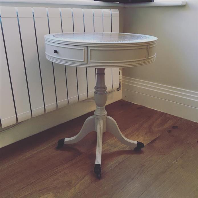
“Purbeck Stone is a clean and understated mid grey that resembles the color of stone found on the Isle of Purbeck, close to our home here in Dorset. Purbeck Stone is the strongest of our Easy Neutrals, sitting contentedly as part of a calming scheme with Cornforth White, Wevet and Ammonite in homes both old and new.” Here’s Purbeck Stone hand-painted on a piece of furniture below. A professional painting company can help you with projects like these and the interior and exterior of your entire home.
Original article at www.mydomaine.com

Hi Tiffany — great article on neutral paint colors (a classic look that can be hard to perfectly capture!). We appreciate your interior design insights and thus featured your article on Studio Designer’s Facebook – https://www.facebook.com/StudioWebware/posts/2241869619160261 – and Twitter – https://twitter.com/studiowebware/status/965273455846289408
Thanks Ken !