

Pantone recently unveiled its Colour of the Year for 2022, and it is quite different from what we’ve seen before. That’s because ‘Very Peri’ – a warming, bold lavender tone – is a brand new shade that Pantone has invented from scratch.
Described by Pantone as ‘a dynamic periwinkle blue hue with a vivifying violet-red undertone that blends the faithfulness and constancy of blue with the energy and excitement of red’ – it’s a color promising to bring joy as the ‘happiest and warmest of all the blue hues’.
So interesting! According to Jason DeRusha of WCCO CBS Local “it’s a prety nice color”

How to use Very Peri in your home
Very Peri has great potential! You should not be afraid to experiment with this bold and fun color. The real question is… How do we use this purple color in our homes?
This Pantone selection is great for providing an eye-catching pop of color – either through a painted wall or accent furniture. Or, if you only want a touch of Very Peri in your home, pick out blue or lilac glassware accessories and group them together for impact. Top it off with a few stems of lavender. For something simpler, look for cushions and throws in purple hues to work the color into your living room or bedroom.
Here are some other recommendations that may offer a vision for using this bold new color in your home.
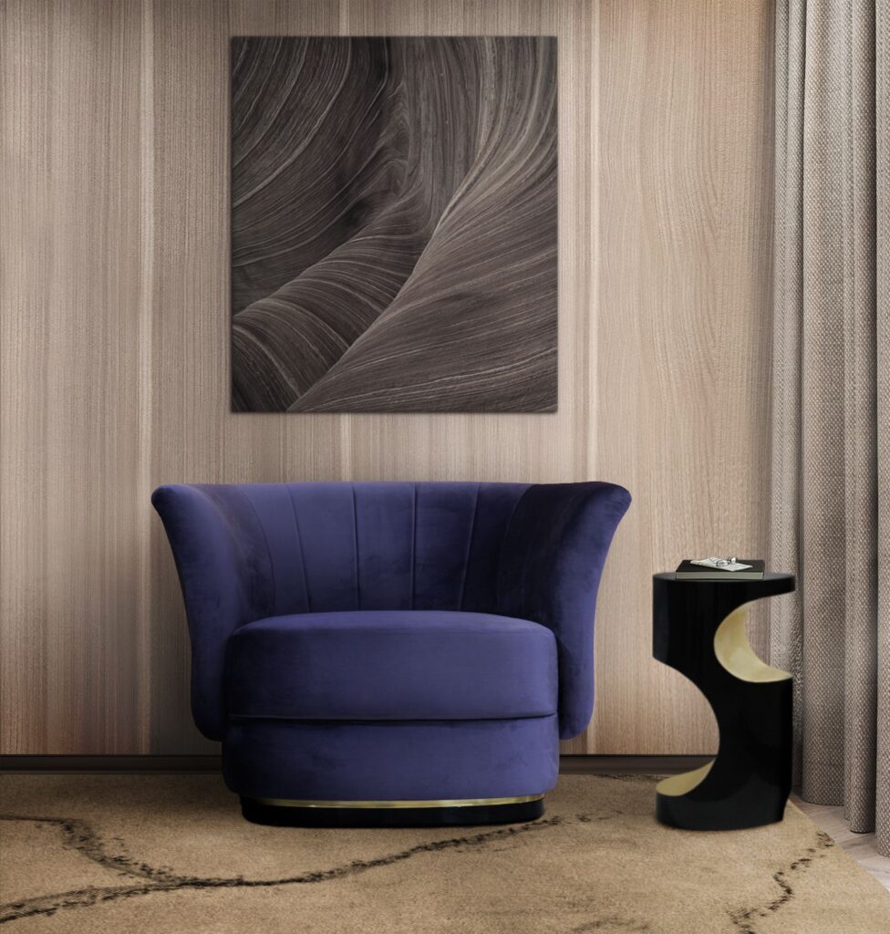
Introduce a statement piece of furniture
Add a pop of color and accentuate the living room with statement furniture pieces in Very Peri. You can even introduce this bold hue into the headboard of your bed. Introduce Very Peri as a solid color or in the form of bold patterns in upholstery materials like velvet, cotton, linen, jacquard, and faux leather.
If you feel that Very Peri might look too bold in large doses, then bring in this trendy, new color in quieter ways. Perhaps in the bed linen, bedsheets, cushions, curtains, rugs, or throws. This is a less permanent way to introduce the Pantone color of the year. Add a dash of color to your dining table setting with a Very Peri table cloth, table mats, and even paper napkins. You can add a touch of this color into your bathroom in the form of Very Peri hand towels, decorative soap dispensers or accessories, and a shower curtain.
Find the right color palette
Introduce Very Peri into the color palette of your home with some unique color combinations. This one-of-a-kind shade pairs wonderfully with white, pink, beige, green. Also, it offers great value when paired with orange and yellow tones.
Tip: this shade looks different in natural lighting and may achieve a yellowish tinge in warm lighting.
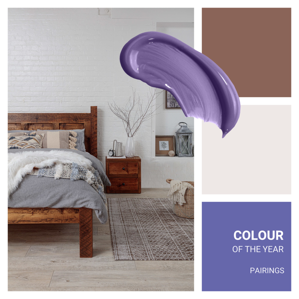
Pairing orange and yellow hues with Very Peri can help make each of these colors appear more vivid, as they are complementary and sit opposite one another on the color wheel. This pairing creates a bold statement for your interiors and can be incorporated into your home by using Very Peri wall paint and orange and yellow decorative items.

Pantone Tangerine and Very Peri
HOUSE BEAUTIFULPantone Yellow Cream and Very Peri
HOUSE BEAUTIFUL


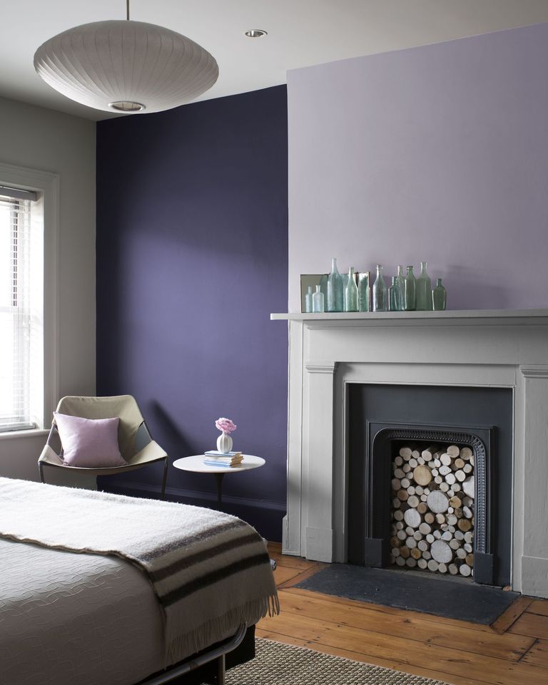
Highlight an accent wall
Breakaway from neutral-toned walls and paint them in an accent color. You can inject personality and a new vibe into your home by introducing Veri Peri into the accent walls of the living room or bedroom. In color theory, cool colors calm us and a splash of this hue prevents the room from looking sterile and boring. You can opt for wall paint, wallpaper, or textured paint to add depth.
Use as a uni-sex hue for a children’s room
Consider infusing a sense of playfulness to your teenagers’ bedrooms by adding this fun color to the laminates of the cabinetry. Keep in mind that Very Peri is a unisexual color and is perfect for decorating boys’ and girls’ bedrooms. Combine it with neutral tones so that this bold shade does not look overwhelming.
If you’re pregnant and opting not to know the sex of your baby, this Pantone Color of the Year offers a sure-fire solution to decorating the baby’s new room.
About Pantone Color of the Year
“The Pantone Color of the Year selection process requires thoughtful consideration and trend analysis. To arrive at the selection each year, Pantone’s color experts at the Pantone Color Institute™ comb the world looking for new color influences. These can include the entertainment industry and films in production, traveling art collections and new artists, fashion, all areas of design, popular travel destinations, as well as new lifestyles, playstyles, and socio-economic conditions. Influences may also stem from new technologies, materials, textures, and effects that impact color, relevant social media platforms, and even upcoming sporting events that capture worldwide attention. For 23 years, Pantone’s Color of the Year has influenced product development and purchasing decisions in multiple industries, including fashion, home furnishings, and industrial design, as well as product packaging and graphic design.” ~Pantone | X-Rite
Contact Tiffany Hanken Interior Design
Need help? Interior design can be overwhelming. At Tiffany Hanken Design, we bring professionalism and years of design experience into your home’s space to help design the life you love – from your color selections to furniture placement and more.