
When you think of springtime, what color palettes come to mind? This spring there are some really fun color combinations that I want to try out. They are slightly less common but absolutely perfect for this time of year. From lime green and red to aqua and orange, these color combinations are going to make you rethink traditional springtime palettes!
Coral & Emerald
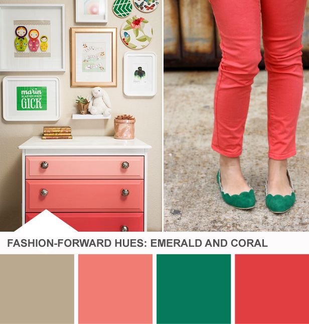
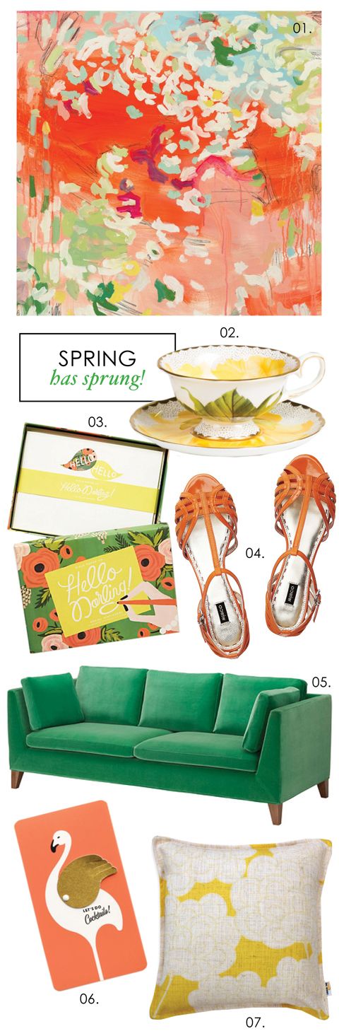
Being on the opposite side of the color wheel, coral and emerald go beautifully together. Other colors that look great with this combination are yellow and beige.
Lime Green & Red
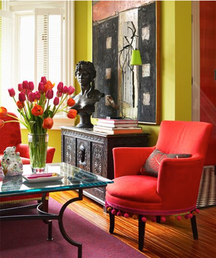
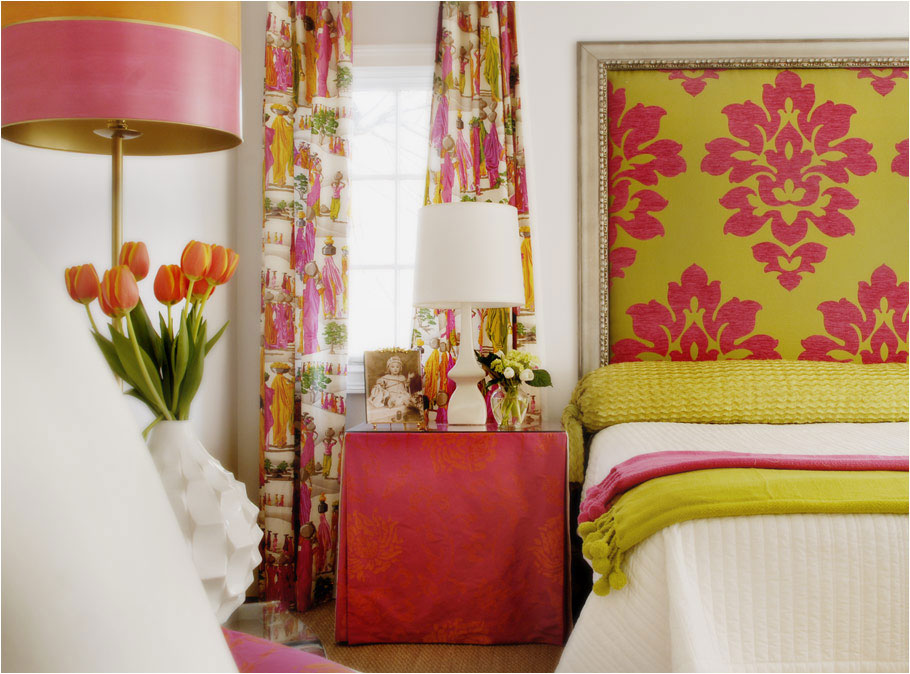
I know how bizarre lime green and red sounds (aren’t green and red for Christmas?) but you can see in the pictures above that they are great complementary colors!
Peach & Orange
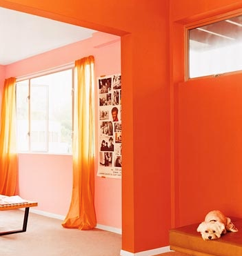

Of all of the new spring color palettes, I think this one is the most shocking! Mixing shades of the same color can be a great way to brighten up a room – especially if it’s a color as vivid as orange.
Navy & Fuchsia
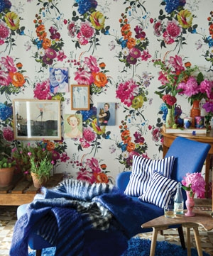
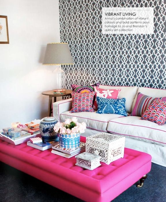
Navy and fuchsia are both such brilliant colors, and together they make an unbeatable combination. A great addition to this color palette is mint.
Aqua & Orange


Aqua and orange give off a beautiful sunset over a beach vibe. The orange can range from bright to burnt and will always look great with a lovely aqua like the shades above.
What are some of your favorite under-the-radar spring color palettes? Am I missing any?